15 of November of 2025
GA4 Looker Studio Dashboard: Automate Reports in Minutes

Isaac Correa
Google Analytics
Looker Studio Templates

Automate GA4 reports with Looker Studio templates. Professional dashboards instantly. Real-time data, custom branding, zero coding. Skip manual reporting.
GA4 Looker Studio Dashboard: Stop Wasting Hours on Manual Analytics Reports
Here's the thing nobody tells you about Google Analytics 4. The interface looks modern. It promises insights. But when you actually need to build a report? You're lost in menus.
You find yourself clicking through eight different sections just to pull basic metrics. By the time you've compiled everything, two hours have disappeared. Your client is waiting. Your team is asking for updates that never seem to come fast enough.
This shouldn't be how analytics work.
The real problem isn't GA4 itself. It's how we access the data inside it.
Why GA4 Dashboards Take Forever
When you open GA4 looking for a client ready report, you face immediate friction.
The interface prioritizes exploration over clarity. Dimensions and metrics live scattered across multiple tabs. Building something professional enough to show stakeholders means manual work that pulls you away from actual analysis. Many agencies resort to screenshots pasted into PowerPoint because GA4 doesn't provide an efficient export path.
According to research from DashThis on GA4 reporting workflows, professionals building custom dashboards manually invest 12 to 18 hours per report. That's before maintenance kicks in. Google updates GA4 frequently, and when it does, your carefully constructed dashboard often breaks.
The problems compound:
No client branding. Reports arrive generic and uninspiring.
Manual data extraction. Everything requires exports, copy pasting, formatting in spreadsheets.
No real time updates. Last week's data is what you're presenting today.
Broken filters. When you finally get everything working, a Google update ruins half your metrics.
When someone needs to see how last month performed compared to this month, you can't just refresh. You rebuild.
What Analytics Actually Needs
Strip away the complexity and most organizations ask five core questions about their data.
How many people visit? Where do they come from? What do they do when they arrive? Are they taking meaningful actions? Is performance trending up or down?
Everything else is supporting detail. Important sometimes, certainly, but not foundational.
The problem is that GA4 treats every possible metric with equal prominence. Google's own documentation on GA4 structure confirms this approach prioritizes flexibility over clarity. Real business decisions happen when you can see the forest, not when you're counting individual trees.
Take engagement as an example. Raw visitor counts mean almost nothing in isolation. If 10,000 people visit but 9,500 bounce immediately, those numbers hide failure, not success. Understanding session depth, pages viewed, and actual interaction patterns tells you whether content resonates.
Conversion tracking should be transparent. Someone completes a purchase or fills a form. These events need to show up clearly without requiring technical configuration knowledge. Yet GA4 asks you to understand event parameters, conversion settings, and data stream configuration before you can see results.
Revenue attribution gets complicated fast. A customer discovers you through organic search, returns via social media, and converts through email. Which channel deserves credit? GA4 has models for this, but finding them requires navigating multiple screens and understanding attribution logic that changes based on your settings.
The Looker Studio Solution
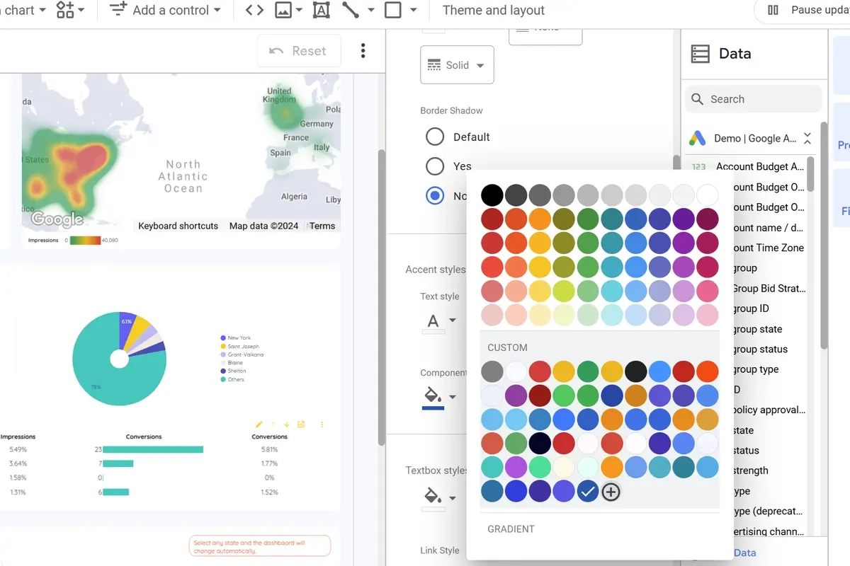
Looker Studio (previously Data Studio) connects directly to GA4 and lets you design exactly what you need.
Here's where most solutions fall apart though: building from scratch in Looker Studio takes almost as long as configuring GA4 manually. You're back to square one. Looker Studio templates eliminated that friction entirely.
Pre-built templates provide proven frameworks that already solve these problems. Instead of starting blank, you inherit the work of designers and analysts who've built dozens of dashboards. You connect your data, wait a moment for everything to load, and you're working with something immediately useful.
The time savings become obvious immediately. What took days now takes minutes. According to Looker Studio's platform analytics, businesses using templates report 80 percent less time on report creation compared to building from scratch.
Maintenance essentially vanishes. When Google updates their system, template creators push updates. Your dashboard keeps working without you troubleshooting what broke or how to fix it. Even complex tasks like learning Looker Studio tips and tricks or implementing advanced features become unnecessary because templates handle the heavy lifting for you.
The kodalogic Difference
When you purchase a GA4 template from kodalogic, the process looks completely different from traditional template platforms.
You don't navigate documentation. You don't copy a file and puzzle through connection steps. Instead, you get taken to a dedicated page where you enter your essential information. The dashboard builds automatically. Kodalogic handles the technical setup. You skip straight to analysis.
Here's what makes this matter: you can create unlimited dashboards without hitting any ceiling. Different properties? Different clients? Seasonal deep dives? Build as many as you need. Each one lives in your Looker Studio account, fully customized, immediately live.
The best part is that this approach respects your expertise. You're not learning new tools. You're not becoming a dashboard builder. You're focusing on interpretation and strategy, which is where your actual value exists. No need to worry about Looker Studio pricing models or figuring out complex configuration. The template does that automatically.
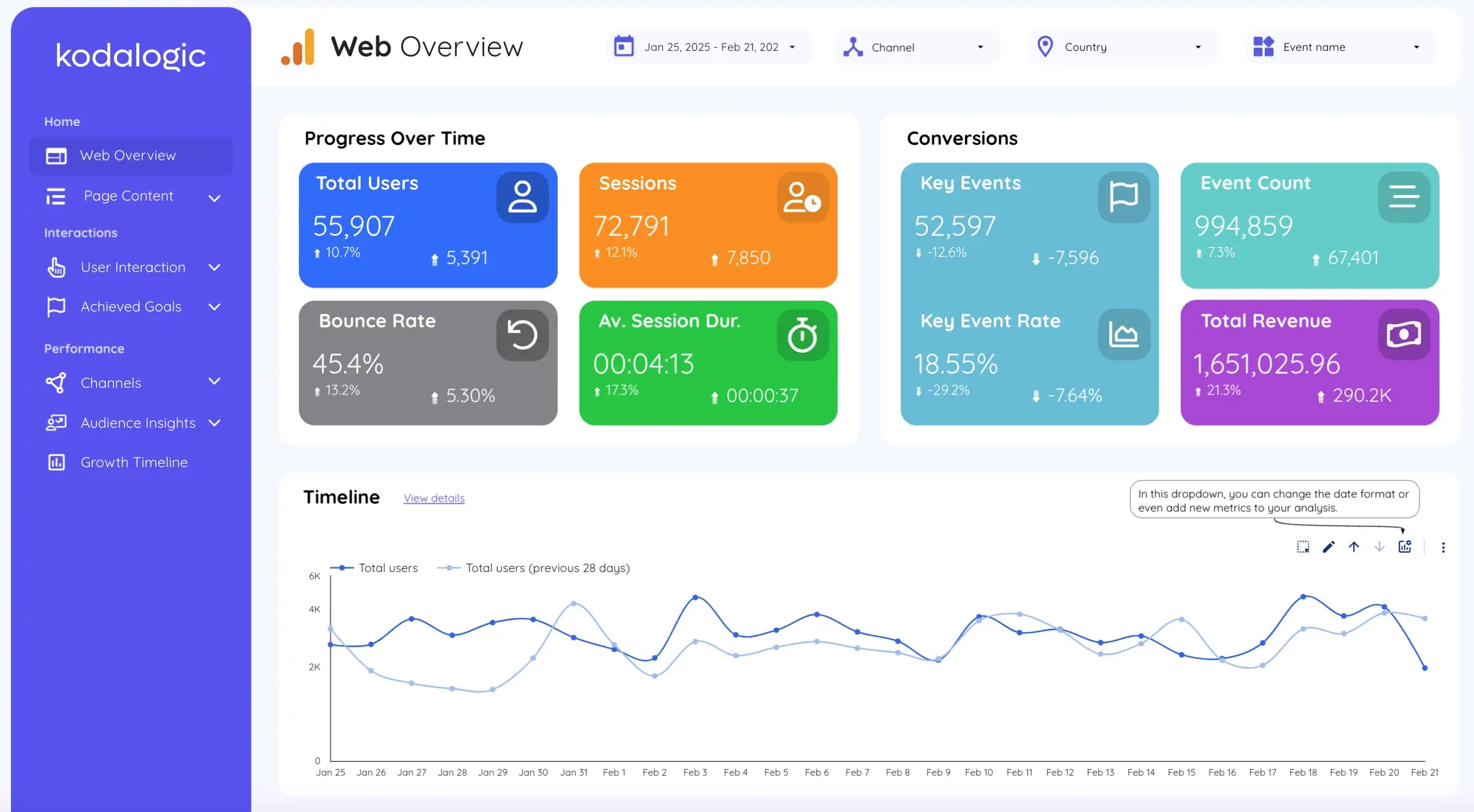
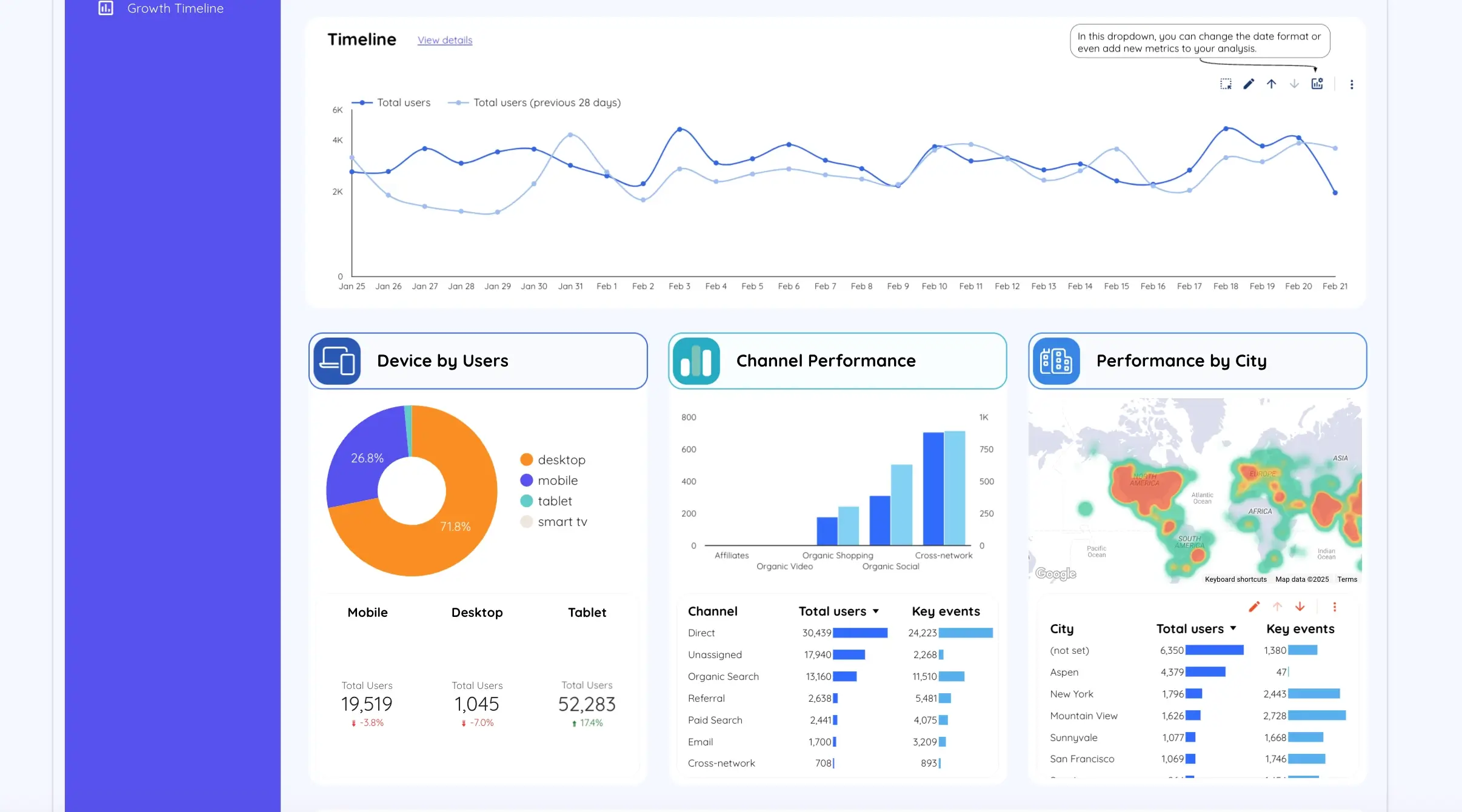
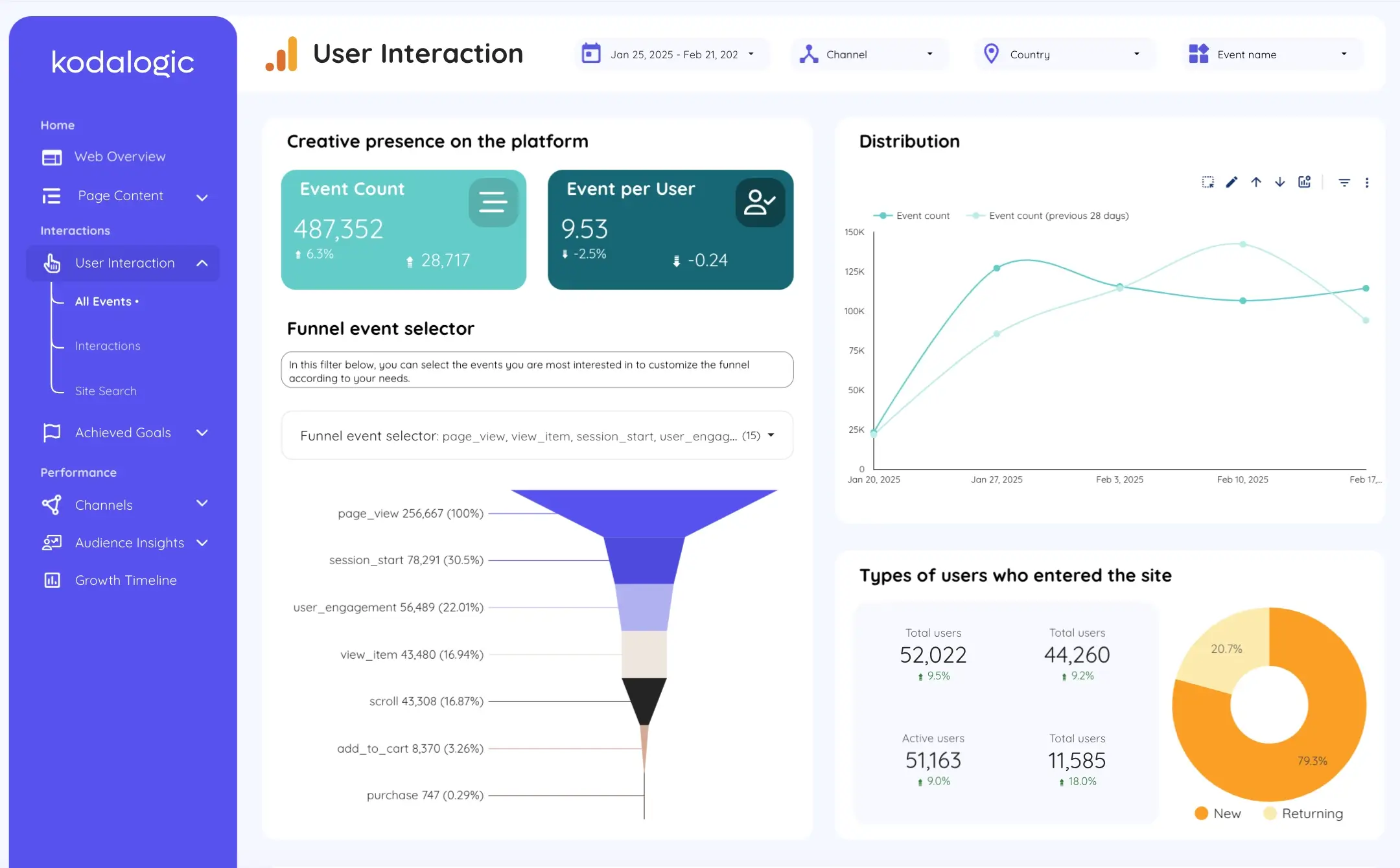
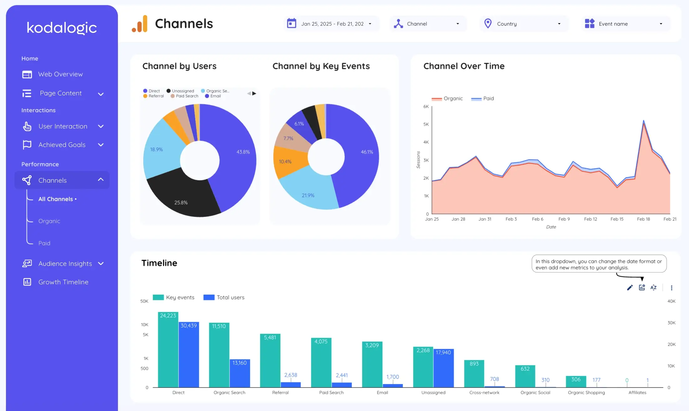
What Lives Inside Your Dashboard
![]()
The structure organizes naturally around how you actually think about performance.
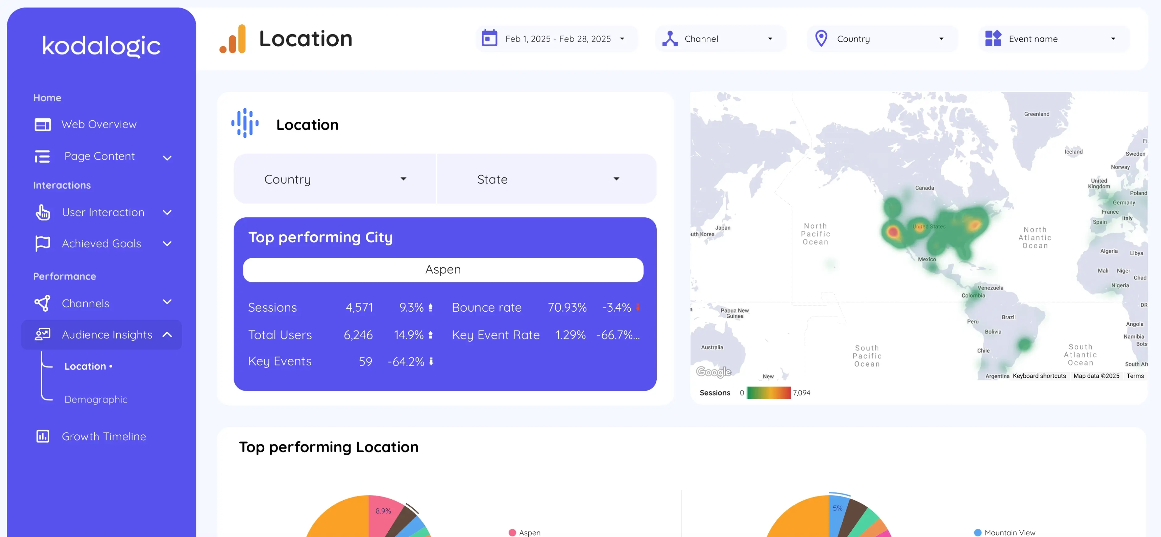
The overview gives you the instant health check. Total visitors, sessions, conversion rate, and revenue appear together. These top-line metrics tell you immediately if things are moving positively or if something needs attention. You see traffic trends over your selected time period. You see which channels drive volume. Geographic distribution shows you whether you're reaching your intended markets.
The engagement section shifts focus to how visitors actually use your site. Page performance breaks down individually. You see which content pieces attract attention. Bounce rates show up alongside engagement depth. You can identify which pages keep people exploring versus which ones cause exits.
Acquisition reveals which marketing efforts actually generate results. Organic search, paid campaigns, social media, email, and direct traffic all appear in context. Understanding the split helps you allocate resources to what works rather than chasing vanity metrics.
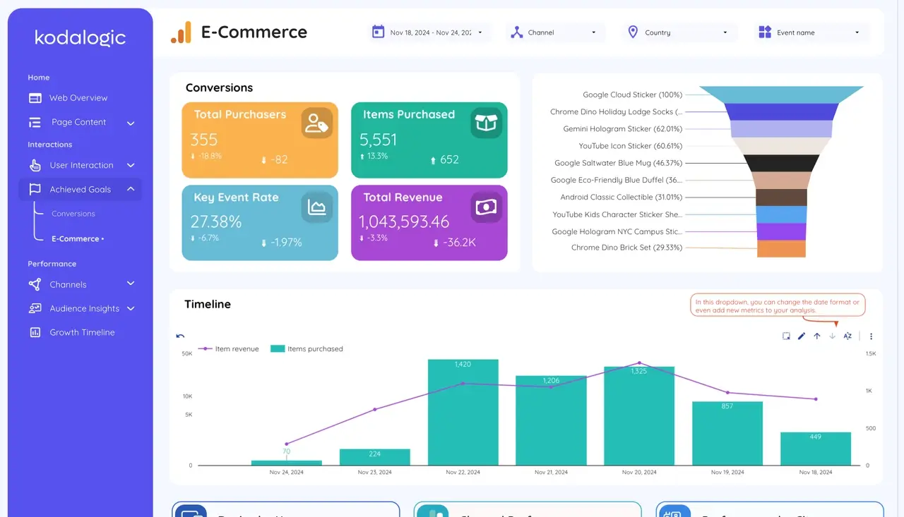
The conversions module shows whether visits transform to value. You see conversion events clearly. You understand which traffic sources deliver qualified visitors. You see device-specific performance. For ecommerce, revenue and transaction data appear alongside traffic metrics so you can calculate value per visitor across channels.
Audience data adds critical context. You see who you're reaching. Demographics, geographic patterns, and device preferences paint a picture of your actual audience versus your target audience.
Each section filters independently. Change the date range and everything updates instantly. Filter by channel and see only relevant data. The interactivity means you're not stuck with what the dashboard creator decided to highlight. You explore what matters for your specific question.
Manual Reporting Versus Automated
The comparison becomes obvious once you've experienced both approaches.
Manual GA4 reporting means screenshots and Word documents. You spend hours every week compiling information. Formatting inconsistencies happen constantly because you're building each report fresh. Updates take forever because changes mean starting over. Clients see disorganized presentations that look different every month.
Automated dashboards in Looker Studio update in real time. You click to explore. Filters adjust instantly. You never send stale data because the connection lives and updates continuously. Client presentations look professional and consistent. The time you save compounds weekly, then monthly, then transforms how you work.
Instead of spending Monday morning on reporting, you spend it on strategy. That's when great work happens.
The Setup Process
Marketing claims about fast setup usually exaggerate reality.
This time, they don't.
You purchase the template from kodalogic. You receive a link. You click it and grant permission for the dashboard to access your GA4 property. You select which property you're connecting. Done.
The dashboard populates automatically. You're analyzing real data within minutes. No API keys to configure. No complex permission structures to understand. No reading documentation trying to decode what goes where.
The first time you see this in action, it's genuinely striking how different this feels from traditional analytics setup workflows.
Customization Without Complexity
Pre-built templates cover the 80 to 90 percent of needs that remain consistent across businesses.
That remaining 10 to 20 percent often requires adjustment to match your specific situation. Looker Studio makes this straightforward, especially if you've learned a few Looker Studio tips and tricks.
Adding custom metrics is simple. Events that matter specifically to your business can be inserted wherever they make sense. The existing structure gives you a framework to build on.
Branding customization takes minutes. Adjust colors to match your company standards. Add logos. Make the dashboard visually represent who you are. Clients see something that feels theirs immediately. Unlike exploring vague Looker Studio pricing options, template customization is transparent and unlimited.
Removing unnecessary sections keeps dashboards focused. If you don't run ecommerce, hide revenue modules. If only organic matters, collapse paid advertising sections. You're not stuck with everything the template included.
The goal is making the dashboard genuinely yours while respecting the structural foundation that already works. Change what needs changing. Resist the urge to rebuild everything from scratch. That defeats the entire purpose of using templates.
Beyond Basic Metrics
Real analytics work extends past dashboard setup.
Once you're actually looking at clean data without spending 80 percent of your effort on compilation, you notice patterns. Organic traffic from a specific keyword cluster converts exceptionally well. Content targeting related terms could capture additional volume. Revenue from that channel jumps 40 percent in the following quarter.
Or you discover that mobile users bounce at twice the rate of desktop visitors. Investigation reveals slow page loading on mobile devices. Fixing performance issues raises mobile conversions 25 percent.
These opportunities exist in every analytics implementation. They hide when your data is difficult to access and understand. Proper dashboards surface them naturally.
According to HubSpot's research on data-driven organizations, companies using analytics dashboards effectively see 5 to 8 times higher return on marketing investment compared to those making decisions based on incomplete data or intuition. The advantage builds over time as each optimization compounds.
One month of better insights leads to better decisions, which leads to better results. Six months of this creates a tangible competitive edge. Twelve months and the improvement becomes structural.
Common Dashboard Mistakes
Having a dashboard doesn't automatically make you data-driven. Plenty of organizations set up beautiful analytics and then rarely look at them.
The biggest mistake is tracking too much. When you monitor 47 different metrics simultaneously, you're not really monitoring anything. Everything becomes noise. Focus instead on the 5 to 8 numbers that genuinely matter for your business. Master those. Everything else is distraction.
Ignoring context makes numbers meaningless. A 20 percent traffic increase sounds excellent until you realize it came entirely from bot traffic or accidental clicks that bounced immediately. Always look at engagement alongside volume. Always ask what the numbers actually mean.
Failing to act on insights wastes the entire exercise. Analytics exist specifically to inform decisions, not to generate attractive charts. Every time you review your dashboard, ask yourself what you'll do differently based on what you see.
Set a regular review schedule and stick to it. Most organizations benefit from weekly dashboard reviews. Some fast-moving operations need daily checks. Choose what makes sense for your situation and build it into your routine. Consistency matters more than frequency.
Information Architecture Principles
How information is organized determines how quickly you can use it.
When you open a dashboard, your brain immediately looks for patterns. If the layout matches how you naturally think about business, you understand what you're seeing instantly. If the organization creates cognitive friction, you get frustrated.
The best dashboards follow visual hierarchy principles. The most important metrics appear with the highest visual emphasis. Supporting details remain accessible without dominating attention. Charts use the right visualization for each data type. Tables appear for detailed exploration. Line charts show trends. Pie charts display distribution.
Mobile responsiveness matters more than most dashboard creators acknowledge. Your insight won't wait until you're at a desk. You need to check performance on your phone. The dashboard should work equally well on any screen size without losing clarity.
Interactivity should feel natural. Filtering shouldn't require hunting for controls. Date range adjustments should be obvious. Exploring specific segments should happen without reading instructions.
These details separate adequate templates from excellent ones. The difference feels minor until you're actually using the dashboard daily.
Team Collaboration Benefits
Dashboards aren't just individual analysis tools.
When teams share the same source of truth, alignment happens automatically. Your director stops wondering if marketing is actually working. Your sales team sees exactly where leads come from. Your product team understands which features drive engagement. Everyone reads from the same dataset.
This shared visibility eliminates arguments about what the numbers are. You're not debating whether performance improved or declined. The dashboard shows it. You're debating what to do about it, which is where your intellectual energy should go anyway.
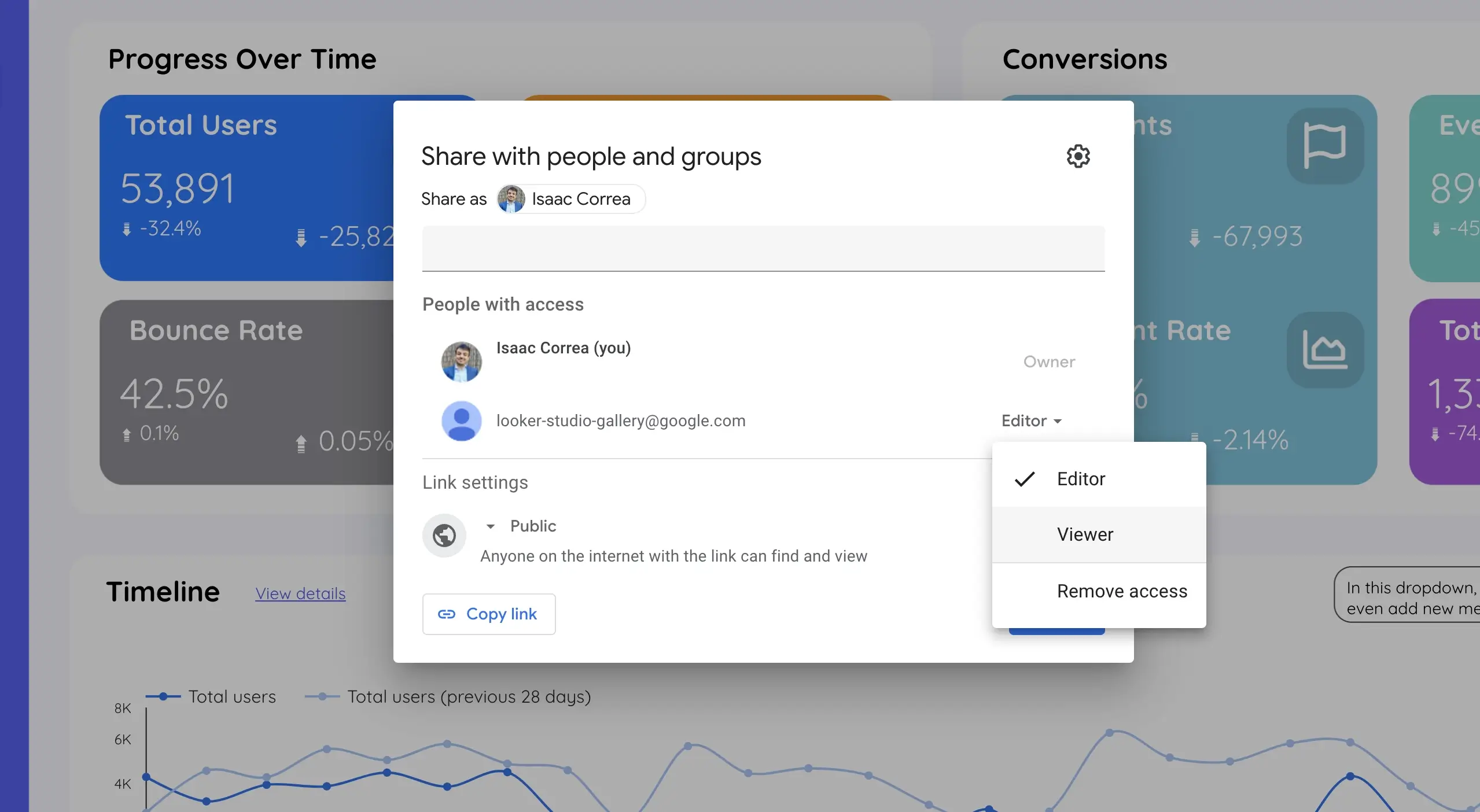
Permission structures in Looker Studio let you share reports with whoever needs them. Clients see relevant metrics without accidentally viewing confidential business data. Team members can explore fully while maintaining data security. Different people see different dashboards based on what matters for their role. This level of granular control is something many worry about when considering Looker Studio pricing and value.
Advanced Features Worth Exploring
As you grow comfortable with your dashboard, you might want to explore Looker Studio's AI features like Gemini integration. These conversational analytics capabilities let you ask questions about your data naturally, without needing to drill through reports manually.
Some teams also invest time in learning advanced certification paths to master every aspect of the platform. If security matters, you can even implement Looker Studio password protection to ensure only authorized team members access sensitive dashboards.
The Time Investment Worth Understanding
Time is the real currency in analytics.
You have two options. Spend 15 to 20 hours building and maintaining custom dashboards that accomplish what a template does automatically in minutes. Or invest two minutes connecting a template and use your time on actual analysis.
This isn't about being lazy. It's about directing your effort toward work that creates value rather than work that just needs doing.
When you have clean data, insights start appearing immediately. Patterns emerge. Opportunities surface. You start noticing what works and why. Optimization becomes possible because you can actually see what needs optimizing.
The math on this is simple. If a template saves five hours per month, that's 60 hours annually. For most professionals, that's a meaningful amount of freed up time. For agencies, that time multiplies across multiple client properties.
The cost of templates is typically a fraction of what you'd invest in hours alone.
Building Your Analytics Culture
The final piece isn't technical. It's cultural.
Dashboards only matter if people use them. When information is easy to access, people naturally start checking it. When checking becomes habitual, decision-making improves. When decisions improve consistently, culture shifts toward being data-informed.
This doesn't happen overnight. But it happens reliably when the friction disappears.
Start with your most important metrics. Review them regularly. Let patterns emerge. Notice what changes and what stays constant. Share these observations with your team. Over time, data becomes part of how you think about your business rather than an obligation you fulfill.
Getting Started Today
The gap between wanting better analytics and having them has never been smaller.
You don't need a development team. You don't need weeks of learning new platforms. You don't need expensive consulting engagements or in house expertise.
Purchase the kodalogic template. Click through their setup page. Enter your GA4 property information. Your dashboard creates automatically with your actual data loading live.
Within the time it takes to grab a coffee, you're looking at professional grade analytics visualization that updates in real time, works across all your devices, and gives you the clarity that GA4's native interface never provided.
That's it. That's the entire process.
The Investment ROI
When you calculate the actual return, template-based dashboards make financial sense immediately.
Compare the cost against your hourly rate. Calculate how many hours you'd spend building a custom dashboard from scratch. Factor in maintenance time over a year. The template pays for itself in the first week of implementation.
But the real value appears when you start using clean data to make decisions. Small optimizations compound. Better channel attribution means investing more where results justify it. Understanding device-specific behavior drives experience improvements. Identifying underperforming content helps you allocate creation resources effectively.
These aren't hypothetical benefits. These are basic analytics in action.
Get the kodalogic GA4 template today. Your future self will thank you every time you pull up a clean, real-time dashboard instead of wrestling with screenshots and spreadsheets.