13 of November of 2024
SEO Insights with Smart Dashboards for Looker Studio

Isaac Correa
SEO & Marketing Dashboards
Looker Studio Templates

Discover how Smart Interpretations transform your SEO dashboards into actionable insights—automatically.
An SEO dashboard that only shows numbers is half a dashboard. The other half is telling you what those numbers mean. That second half is where almost every tool on the market stops — and where this one starts.
The Reporting Problem Nobody Talks About Enough
There is a specific kind of frustration that SEO professionals know well. You have the data. You have the dashboard. You open it every Monday morning. And then you spend the next two hours turning what you see into something you can actually explain to a client or a stakeholder.
That translation work — data into meaning — is where most of the reporting time goes. Not in building the dashboard. Not in pulling the numbers. In sitting with the numbers and figuring out what they are telling you.
According to Data Bloo's agency benchmarks, agencies typically spend 8 to 12 hours per client per month on manual SEO reporting. Swydo's research puts the figure at 4 to 5 hours per client with manual methods, dropping to 15 to 30 minutes with proper automation. For a ten-client agency, that gap represents 40 to 50 hours a month — recovered or lost, depending on your setup.
The dashboard we built at Kodalogic is designed to close that gap at the source. Smart Interpretations reads your live Search Console data and writes the analysis inside the dashboard itself — automatically, every time it refreshes. No interpretation session. No translation layer. The data arrives already explained.
This is what a proper Looker Studio SEO dashboard looks like, what it needs to include, and why the feature that makes ours different from everything else on the market actually matters in practice.
Why Looker Studio Is the Right Platform for This
Before getting into what the dashboard contains, the platform choice is worth explaining — because Looker Studio is not the obvious first choice for every SEO team, and the reasons it ends up being the right one are specific.
It connects directly to Google's own data. GA4 and Google Search Console both have native Looker Studio connectors — first-party, free, no middleware, no export cycle. The data flows from the source. Search Engine Land's guide to Looker Studio SEO dashboards makes a strong case for this: the platform's ability to replicate the functionality of leading rank tracking tools — tools that took years to develop — in a matter of weeks, is genuinely powerful when used correctly.
It separates the reporting layer from the data layer. Most SEO tools bundle both together, which means you report the way the tool wants you to report. Looker Studio lets you design the reporting structure around how you actually think and what your clients actually care about.
The limitation has always been build time. A properly structured Looker Studio SEO dashboard — with the right calculated fields, correct comparison logic, brand versus generic segmentation, intent classification — takes real time and real Looker Studio knowledge to set up correctly. That is the problem the Kodalogic template solves: it connects to your property and populates immediately, with every section described below already built.
What a Proper Looker Studio SEO Dashboard Includes
A good SEO dashboard is organized around decisions, not data. Every section should answer a specific question clearly enough that the person reading it knows what to do next. These are the sections that earn their place.
Brand vs Generic Keywords: The Split That Changes Everything
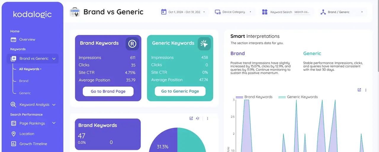
Brand keywords are queries that include your company or product name. They have structurally higher CTR, they reflect existing awareness, and they tell a story about brand recognition — not about whether your SEO is working.
Generic keywords are where SEO investment is supposed to move the needle. Queries where someone is searching for a solution and your site appears among several options. These are the keywords that require real optimization work.
When branded and generic traffic get mixed into a single average position number, both stories disappear. Your branded traffic can be growing while your generic SEO is completely flat — and the aggregate hides it entirely. The Kodalogic dashboard segments these automatically from the first connection. You see each group's impressions, clicks, CTR, and average position separately, with period-over-period comparison for both.
Search Intent: Informational, Navigational, Commercial, Transactional
Not all keywords are created equal. A keyword at position 12 with transactional intent is a revenue problem. The same keyword with informational intent at position 12 might be perfectly acceptable — you would optimize for a featured snippet rather than pushing for top 3.
Without intent context, you are making judgment calls on every single query manually. The dashboard classifies queries by intent automatically. Informational queries — people looking for answers. Navigational — heading somewhere specific. Commercial — evaluating options. Transactional — ready to act. The intent distribution tells you something aggregate position data never does: whether your SEO visibility is reaching people who can buy from you, or just people browsing.
Keyword Clusters: Topic-Level Performance
Individual keyword positions fluctuate constantly. A keyword moving from position 8 to 11 over a week might mean nothing — or it might mean a lot. You cannot know from a single data point.
Keyword clusters group semantically related queries so you evaluate performance at the topic level instead of the query level. When a cluster of keywords related to a specific content topic gains ground collectively over four weeks, your content strategy for that area is working. When a cluster declines, you see it at the topic level before any single ranking drop becomes a traffic problem. That early signal is worth considerably more than any individual position number.
Ranking Distribution: The Four-Bucket View
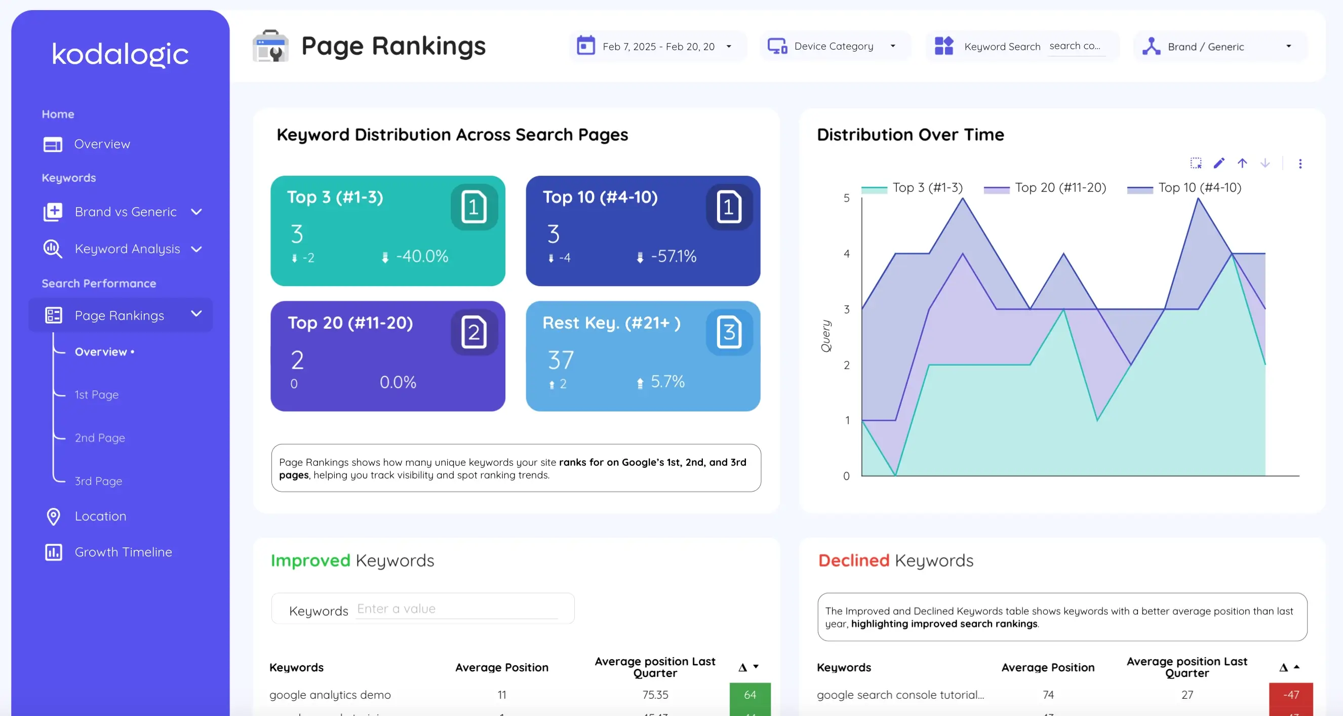
Knowing you rank for 300 keywords is much less useful than knowing how those 300 are distributed across position ranges.
Top 3 — traffic engines. Every keyword here generates meaningful clicks. Protecting and expanding this group is a primary objective.
Positions 4 to 10 — page one, high leverage. A keyword moving from position 7 to position 4 can triple its traffic. These are your best ranking investment.
Positions 11 to 20 — page two. Almost nobody reaches these. They need active optimization or honest deprioritization.
Beyond 20 — long-tail territory or topics you have not invested in yet. Worth monitoring, rarely worth prioritizing over the page-two group.
The distribution view makes ranking progress legible at a glance. When keywords shift from the 11-20 bucket into the 4-10 bucket, that is a concrete win — even if average position barely moves.
Keyword Movement: What Is Gaining and What Is Falling
Most ranking drops do not appear in traffic data until they have been happening for weeks. Catching them at the keyword level gives you time to respond — a content update, an internal link, a title tag change — before the drop becomes an actual traffic problem.
The movement section shows which keywords improved versus the previous period and by how much, and which declined. Not as a monthly surprise. As an ongoing view that updates automatically every time Search Console refreshes. For keywords gaining positions: understand what changed and replicate it. For keywords losing positions: act now.
Geographic and Device Performance
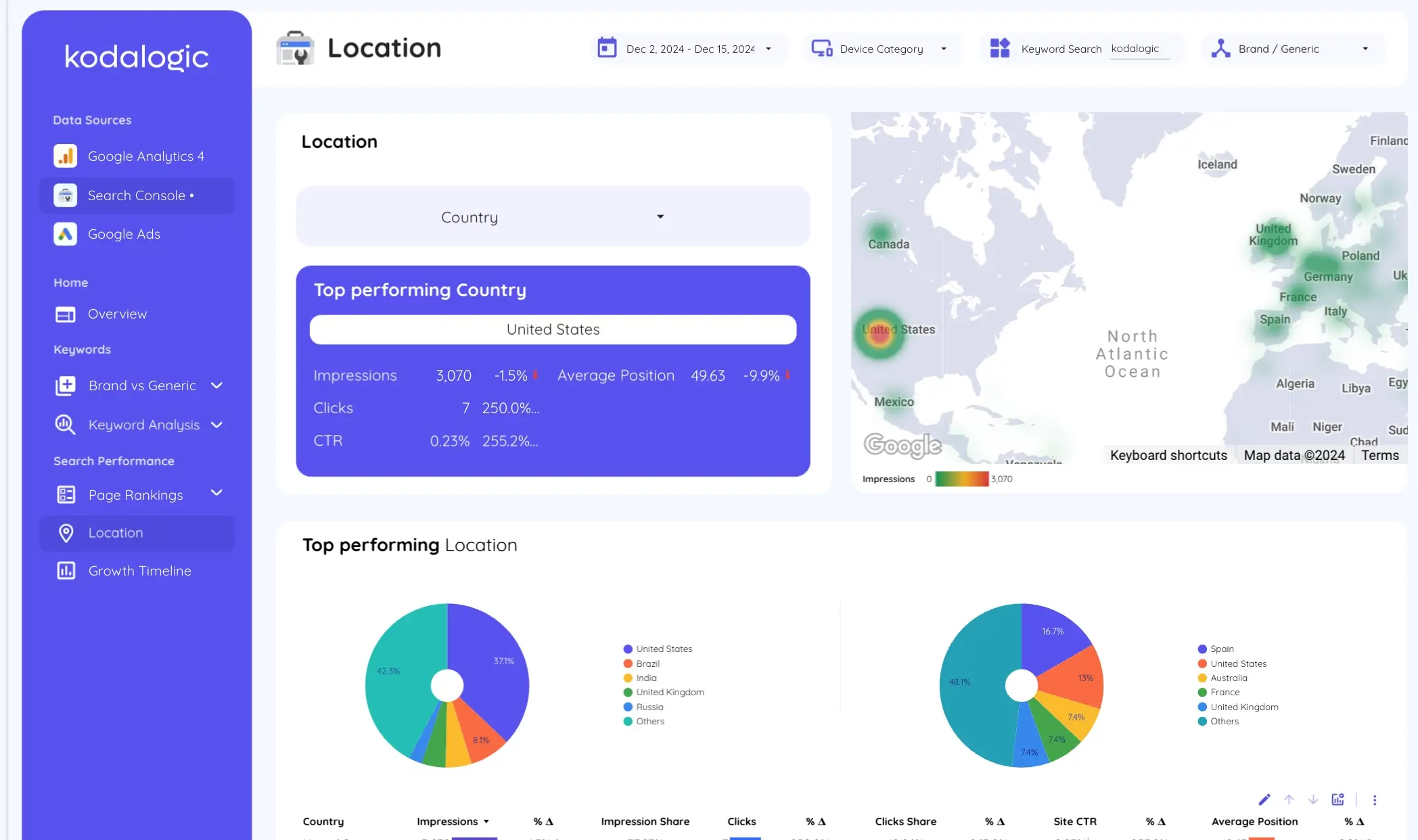
A keyword at position 4 in Spain might be at position 22 in Latin America. Desktop performance and mobile performance often tell completely different stories. These gaps are real optimization opportunities that aggregate ranking data completely conceals.
The Kodalogic dashboard shows impressions, clicks, CTR, and average position broken down by country — with the top performing market surfaced automatically and the ability to filter the entire dashboard view by any location.
Smart Interpretations: What Makes This Different
Most SEO dashboards stop at displaying data correctly. You open the dashboard, see the metrics, and then do the interpretation work yourself. That work is where the hours go.
Smart Interpretations does that work inside the dashboard.
It reads your live Search Console data — your actual property, your actual keywords, your actual clusters — and writes automatic analysis of what is happening. Not generic copy. Analysis tied specifically to your data, updated every time the dashboard refreshes.
When branded impressions hold steady while generic performance declines, Smart Interpretations flags the divergence and explains what it suggests. When a keyword cluster gains ground over several consecutive periods, it surfaces the trend. When CTR drops despite a stable ranking — a signal that the snippet needs work rather than the ranking — it identifies that specific gap.
This is the only public Looker Studio SEO dashboard in the world with this feature. No other publicly available template reads your data and writes the interpretation. SE Ranking's roundup of Looker Studio SEO dashboards covers the leading options in detail — none of them include automated interpretation of live data. That is not a marketing claim. It is simply a feature that does not exist anywhere else in the market at this price point.
For a complete deep-dive into how Smart Interpretations works — including specific examples of the analysis it generates automatically and why no other tool can replicate it — see our dedicated guide: What Is Smart Interpretations?
For SEO professionals managing multiple clients or properties, this removes the interpretation layer from the reporting process. The data does the analysis. You review it, add strategic context where needed, and move to action. Fluency's benchmark data shows that 71% of agency teams say manual processes are actively putting client campaigns at risk — not because their SEO is poor, but because reporting overhead is consuming the time that should go into execution.
GA4 and Search Console Together: Why the Combination Matters
The Search Console dashboard covers keyword and ranking data in depth. But the most complete picture of SEO performance comes from combining it with GA4.
Search Console tells you how users find you. GA4 tells you what they do next.
A page ranking in position 6 for a high-volume query, with strong impressions and reasonable CTR — but with a 90% bounce rate in GA4 — is a content mismatch. The page is appearing for the right query but not delivering on the intent behind it. You would never see that from ranking data alone.
Conversely, a page with modest rankings but strong engagement metrics and high conversion rate in GA4 tells you exactly where to focus link building efforts — because the content already converts, it just needs more visibility.
The Web & SEO Performance Dashboard combines both data sources in a single view, connecting organic traffic behavior from GA4 with keyword performance from Search Console. The All-in-One Dashboard adds Google Ads to the picture — useful for teams running paid and organic together who need to see how each channel affects the other.
Setting It Up
Connecting the Kodalogic Google Search Console dashboard to your property takes under a minute. You authenticate your Search Console account, select the property, and every section described above populates with your actual data.
No manual configuration of the brand versus generic logic. No building of the intent classification system. No coding of the distribution buckets. No cluster framework to set up. It is all already there, waiting for your data.
We cover scheduling in detail in our guide on how to schedule a Looker Studio dashboard for email delivery — once the dashboard exists, it runs and delivers itself on whatever cadence you need. That is the full automation stack: data connects automatically, updates automatically, interprets itself automatically, and sends itself automatically.