06 of April of 2026
What Is an SEO Reporting Dashboard? (And Why It's Costing You Clients)

Isaac Correa
Looker Studio Templates
SEO & Marketing Dashboards

Most SEO agencies send dashboards that impress — and confuse. Here's the framework that actually works: fewer metrics, clearer structure, and clients who finally understand what you're doing for them.
Your SEO dashboard probably looks impressive. It's probably also costing you clients. Here's what changes when you fix it.
The Report Nobody Reads
Picture this. End of the month, your agency sends the client a link to the dashboard. Or maybe a PDF. Forty-seven metrics. Color-coded. Charts going up and to the right.
The client opens it, scrolls for about twelve seconds, and closes it.
Not because the results are bad. Because they have no idea what they're looking at.
This pattern shows up in the data too. According to a 2025 study by BrightEdge, clients who fully understand their SEO reports are 64% more likely to approve budget increases. And from research covering 500+ agency-client relationships, 73% of client churn happens because of poor reporting — not poor results.
The problem isn't the SEO. The problem is the dashboard.
What an SEO Reporting Dashboard Is Actually For
Let's be clear about something from the start. An SEO reporting dashboard isn't a data archive. It's not a place to store everything you know about a client's website.
It's a decision tool.
Its only job is to answer one question every time someone opens it: is this working, and what do we do next?
Google's own content guidelines are explicit about what good content does — it serves people, not algorithms. The same logic applies to dashboards. A reporting dashboard that serves the agency's ego instead of the client's understanding is, by definition, failing at its job.
So let's talk about what a good one actually looks like.
The Metrics That Belong in Your Dashboard
Most agencies make the mistake of showing everything available. It feels transparent. It feels professional. It's actually a sign that nobody decided what matters.
Here's what works, after building dashboards for clients across different industries and sizes.
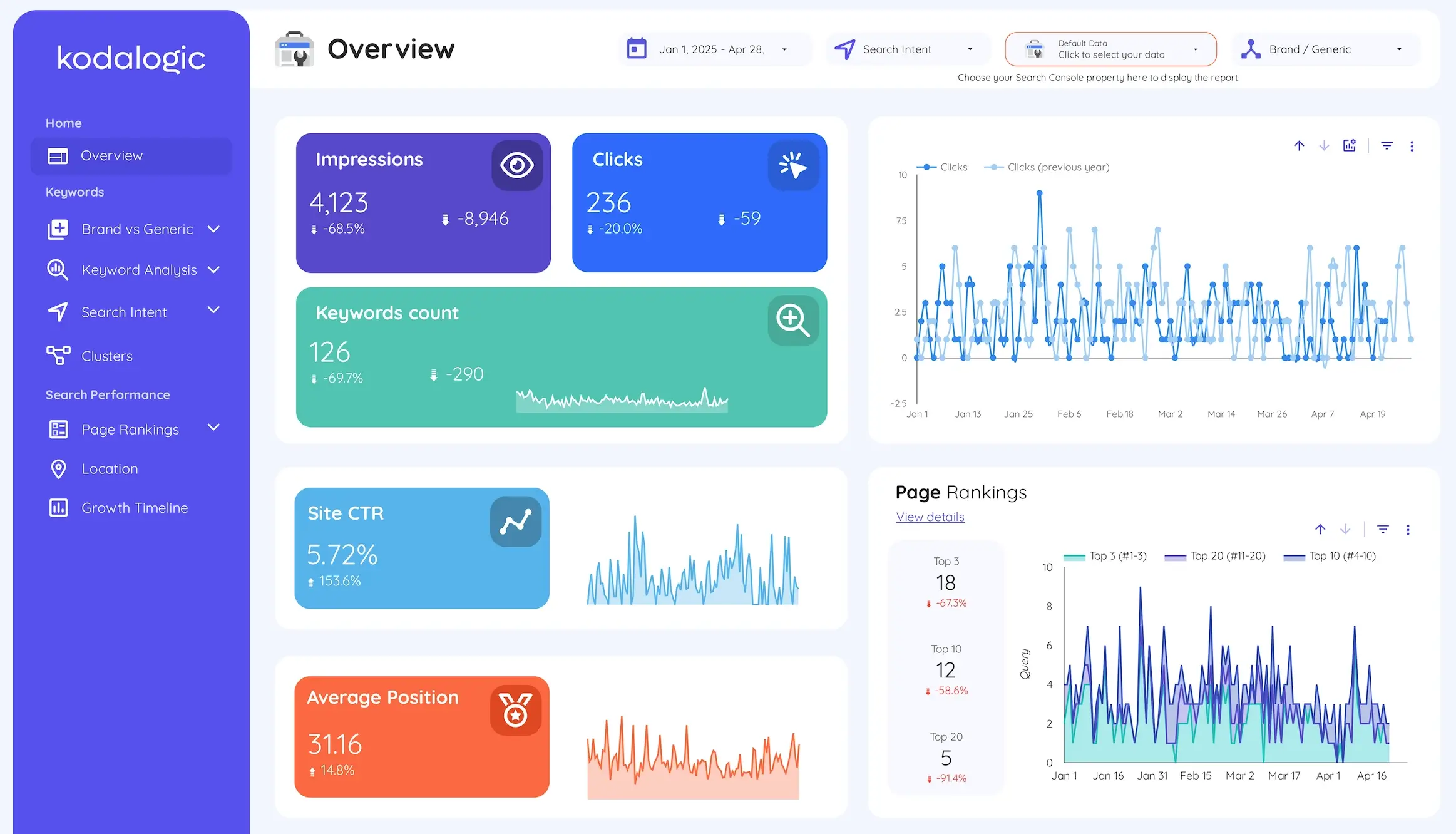
Organic clicks are the headline number. Not impressions, not rankings — clicks. Clicks mean people saw your result and chose to visit. That's the most direct signal that your SEO strategy is reaching real people.
Impressions over time tell you whether your content is getting picked up by Google at all. Impressions grow before clicks do. If they're climbing, you're heading in the right direction even if clicks haven't followed yet. If they're flat or dropping, something is wrong higher up the funnel.
Click-through rate by page is where the hidden opportunities live. A page ranking in position four with a 1.2% CTR is almost certainly underperforming. The title or meta description isn't compelling enough. That's fixable without writing a single new word of content — and it's the kind of specific, actionable insight that makes clients trust you more.
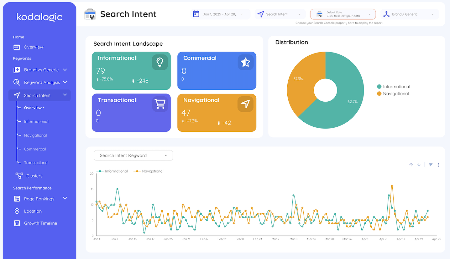
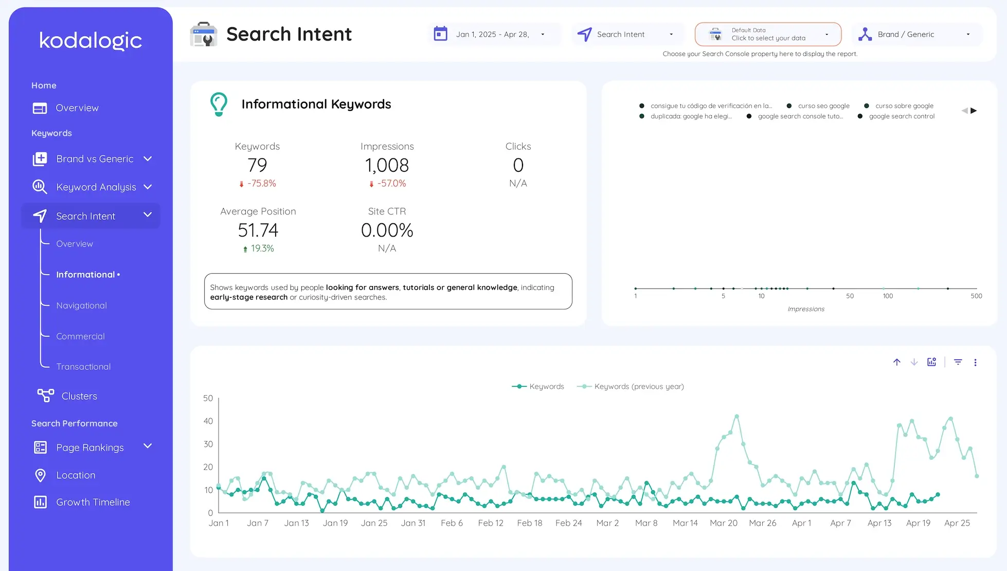
Priority keyword rankings, tracked individually. Not aggregate position across all queries. The twenty or thirty keywords that actually matter to this client's business, tracked week over week. This is what shows progress before traffic metrics move.
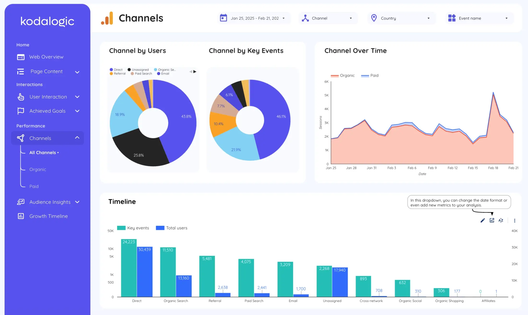
Branded versus non-branded traffic split. This one gets skipped constantly and it really shouldn't. If 80% of your organic traffic is people searching for the brand by name, your SEO isn't driving growth — your brand awareness is. That's a fundamentally different problem, and clients deserve to understand the distinction. If you want to see how to track this properly, our post on dimensions vs metrics in Looker Studio explains how to set it up.
What You Should Leave Out
This is the uncomfortable part. Some metrics feel important because they're measurable, not because they move the needle.
Domain authority is a third-party estimate. It's not a Google signal. It doesn't predict rankings. Showing it to clients implies it does — and it doesn't. Ahrefs covers this directly in their agency reporting guide: domain-level authority scores belong in strategic conversations, not monthly dashboards.
Bounce rate and time on page give you context, but they don't tell you whether your SEO is working. A page with a 90% bounce rate might be a perfectly successful FAQ that answered the user's question in ten seconds. Putting it front and center creates confusion, not clarity.
Crawl errors and Core Web Vitals matter for technical SEO reviews. They don't belong in the main client-facing report. Move them to a secondary tab if you need them visible — but don't let them crowd out what the client actually needs to see.
The Structure That Works
Good SEO dashboards share a structure, even when they look different on the surface. We've seen this across enough client accounts to say it with confidence.
The top section answers the executive question. Organic clicks this period versus last period. Impressions. CTR. Organic sessions. Four numbers, clearly labeled, with comparison arrows showing direction. This is the section a client should read in five seconds. If they can't, redesign it.
The middle section shows trends. Month over month. Same period last year if you have the data. The story behind the numbers — are things improving, holding steady, or slipping in ways that need attention? This is where you earn trust, by showing you understand the context, not just the numbers.
The bottom section surfaces one specific priority. Not a list of recommendations. One thing. The page with the most improvement potential. The keyword group closest to breaking into the top three. One next action, clearly labeled. This is what transforms a dashboard from a report into a conversation starter.
For a deeper look at how to structure these sections inside Looker Studio, our 15 tips for smarter dashboards walks through the setup step by step.
Building a Dashboard Your Clients Will Actually Check
We worked with an agency that was sending a 34-page PDF every month. It had everything: rankings, crawl data, backlinks, Core Web Vitals, engagement rate, branded vs non-branded, three different views of the same traffic numbers. Their client opened it once, skimmed the first page, and emailed back asking "so is traffic going up or down?"
After restructuring into a single Looker Studio dashboard with four headline metrics at the top and one clear priority at the bottom, the monthly check-in call changed completely. Instead of explaining the data, they were discussing what to do next.
This isn't an isolated case. Research from Databox covering 153 SEO agencies found that the reports clients engage with most are those that answer "so what?" for every metric they contain. The agencies that retain clients longest are the ones whose reports answer four simple questions every month: are we improving, what is driving it, what needs attention, and what comes next.
Everything else is noise.
The Real Cost of Manual Reporting
Here's a number worth sitting with. According to research by AgencyAnalytics, agencies spend an average of 2 to 5 hours per client report when building manually. With 15 clients, that's 30 to 75 hours a month — essentially a full-time employee doing nothing but moving numbers between platforms and formatting slides.
At a loaded hourly cost of $75 to $100 for an experienced SEO strategist, a ten-client agency can spend between $2,250 and $5,000 monthly on reporting mechanics rather than actual campaign work.
There's also a quality problem that doesn't show up in time-tracking. Manual data entry means errors. When a client spots an inconsistency — a number that doesn't match what they saw last month, a date range that got misapplied — they don't just question that number. They question all of them.
A live Looker Studio dashboard solves both simultaneously. Data updates automatically. Every number comes directly from the source. No copy-paste, no formulas, no version control nightmares.
We walk through exactly how to set up scheduling so reports go out automatically in our guide to automated SEO reports with Looker Studio.
The Branded Traffic Conversation
Here's something worth saying plainly, because it comes up in client conversations more than you'd expect.
If most of your organic traffic is branded, your SEO isn't working the way you think it is.
Branded traffic means people are already looking for you. They already know you exist. That traffic would come regardless of your SEO investment. It's valuable, but it's not growth.
Non-branded traffic means people found you while searching for something else entirely. That's where organic search actually creates new demand. That's the number that proves your content strategy is reaching new audiences who had never heard of you before.
A dashboard that doesn't separate these two gives clients an inflated picture of performance. And when reality catches up — usually during a contract renewal conversation — the mismatch is damaging.
Showing this split honestly, even when the branded percentage is high, builds more trust than hiding it behind aggregate numbers.
When to Show More Detail
Not every client needs the same level of detail. An enterprise client managing twenty international markets needs different reporting than a local business tracking fifteen keywords. The framework above works for both — but the depth changes.
For smaller clients, the four-number overview plus keyword trends is often enough. For larger accounts, you might add geographic breakdowns, device segmentation, or page-level CTR analysis as separate tabs within the same dashboard.
The key is that every additional layer of detail should answer a question someone is actually asking. If you're adding a section because it looks thorough rather than because someone needs it, you're building a dashboard for the agency, not the client.
Setting It Up Without Starting From Scratch
Building a solid SEO dashboard from a blank canvas is a real project. Getting the data connections right, deciding on the visual hierarchy, making it readable for someone who doesn't live in Search Console — it takes time that most teams don't have to spare.
That's the practical case for starting with a template built specifically for this purpose.
The Kodalogic SEO dashboard templates connect directly to Google Search Console and Google Analytics 4. Your data populates automatically. The structure follows the framework described in this post: headline metrics at the top, trends in the middle, opportunities surfaced at the bottom.
You're not starting from a blank canvas. You're starting from something that already works — and adjusting it to match your clients' specific priorities.
Your clients get a dashboard they'll actually check. Your team gets back those hours every month. And the reporting conversation shifts from "here's what the numbers say" to "here's what we're doing about it."
That's what reporting is supposed to feel like.