An SEO keyword ranking report shows which search queries a site appears for in Google, at what average position. With how many impressions and clicks. A good one also shows how each of those positions moved since the last period.
Which of those queries were worth having. Search Console holds every one of those numbers. What it does not do is arrange them so that somebody can decide something from them.
That arrangement is our keyword ranking report template: 19 pages built on Data Studio (formerly Looker Studio), connected to your own Search Console property, for $129 paid once.
This page walks the template page by page: what is on each screen, and which question that screen answers. Every page below is the report running live on a demo property, which the live demo opens with no account and no sign-up. You can have it open in another tab and click the same pages while you read.
What Search Console gives you, and what the report adds
Everything a keyword ranking report needs starts on one screen. The Performance report in Search Console shows every query your site appeared for, with four metrics: impressions, clicks, click-through rate and average position. It is first-party data, it is free. The positions in it are the ones Google measured rather than a tool's estimate of them.
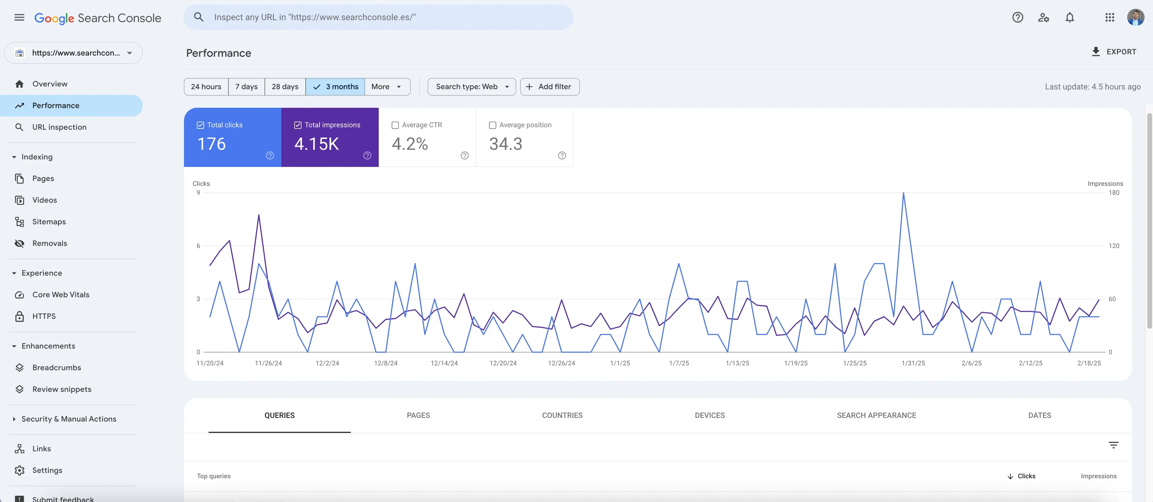
Two things about that screen decide how a report has to be built. Both are documented by Google rather than discovered by us.
The first is the definition of position. Google's own words: position is "a relative ranking of the position of your link on Google, where 1 is the topmost position". The metric shown is the average, "which averages the position value for all impressions (because the position of the link will be different each time it is seen).".
So a query that reads "7.0" was not at position 7. It was at a spread of positions whose impression-weighted mean is 7, and the screen never shows the spread. Every page of the template is built knowing that.
The second is the size of the table. The interface exports at most 1,000 rows, while the Search Console connector for Data Studio, the one the template runs on, reads up to 50,000 rows per day per site per search type. That difference is why a report built from a downloaded CSV and a report built on the live connector are not the same report, even on the same property.
Drag the date picker back as far as it will go and it stops at 16 months, on either route. That makes year on year the longest comparison any report on this data can make, ours included.
What the template adds is not more data. It is the classification. Every query arrives sorted by brand, by length, by intent, by topic and by position band, on every refresh, with no tagging by hand and no spreadsheet in the middle.
The 19 pages at a glance
The left rail of the report is the table of contents, grouped the way somebody reads a property: the summary, then the keywords, then the search performance.
| # | Page | What it answers |
|---|---|---|
| 1 | Overview | How the whole property did this period, against the last one |
| 2 | Brand vs Generic | How much of the site's search comes from its own name |
| 3 | Brand | The branded queries on their own, query by query |
| 4 | Generic | The non-branded queries on their own, query by query |
| 5 | Keyword Analysis | Whether the short queries or the long ones carry the site |
| 6 | Short Tail Keywords | The one, two and three word queries in detail |
| 7 | Long Tail Keywords | The four words and longer queries in detail |
| 8 | Search Intent | What the people searching were trying to do |
| 9 | Informational | The queries of people learning something |
| 10 | Navigational | The queries of people looking for a specific site |
| 11 | Commercial | The queries of people comparing before buying |
| 12 | Transactional | The queries of people ready to act |
| 13 | Clusters | Which topics the site is visible for, and which have no name yet |
| 14 | Page Rankings | How many keywords sit on Google's first, second and third page |
| 15 | 1st Page | The keywords on page one, listed |
| 16 | 2nd Page | The keywords on page two, listed |
| 17 | 3rd Page | The keywords on page three, listed |
| 18 | Location | Which countries the impressions and clicks came from |
| 19 | Growth Timeline | How the property has moved across the whole window |
The same row of filters runs across the top of all nineteen: the date range with the period it compares against, the Search Console property the report is reading. The segments that narrow the screen. Pick a fortnight, a device or a segment once, and the page you are on obeys it.
The keyword ranking report format: the six sections, in order
Before the tour, the shape. A keyword ranking report that answers questions rather than listing rows has six sections. The template puts each one on its own page or group of pages.
First, the four Search Console metrics with their change against the previous period. Second, branded queries separated from generic ones. Third, the count of queries in each position band: 1 to 3, 4 to 10, 11 to 20, and 21 and beyond.
Fourth, the queries that improved and declined most since the comparison period. Fifth, queries by search intent. Sixth, queries grouped by topic.
Some people call the result a keyword rankings and visibility report, because those six sections together are what visibility in search actually means: not one position, but how many queries sit where, for what, and which way they are moving. Search Console itself calls none of this anything. It calls it the Performance report and hands you the table.
Page 1: the whole property on one screen
The Overview is the page a client opens first and often the only one they open. It carries the four Search Console metrics, each with its change against the previous period, plus the count of keywords the property ranked for, a daily chart of clicks, a panel that says how many of those keywords sit in the top three, the top ten and the top twenty. Breakdowns by device and by country.
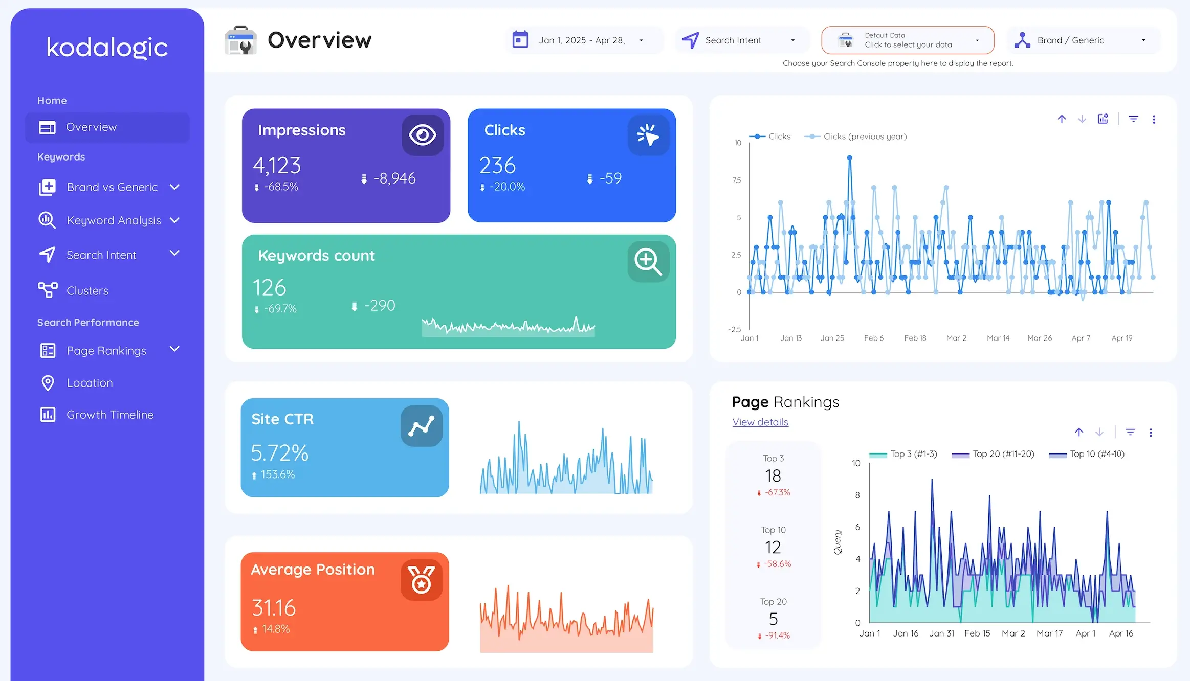
One card on this page is read backwards from the rest. The report labels it so nobody gets it wrong: average position going up is a worse position, because a bigger number is further down the page.
The three big cards are also the fastest way to learn what the report is for. Impressions, clicks and click-through rate can point in directions that look like a contradiction and are not: a property can lose impressions at positions where nobody was clicking anyway, keep every click it had. Watch its rate climb while it shrinks. Page one raises that question. The other eighteen pages are where it gets answered.
Pages 2 to 4: brand queries apart from generic ones
The first thing the report does to the query table is split it in two: the queries that contain your name, and the ones that do not. The split has a name of its own, brand versus generic keywords. It is the page we would keep if we had to drop the other eighteen.
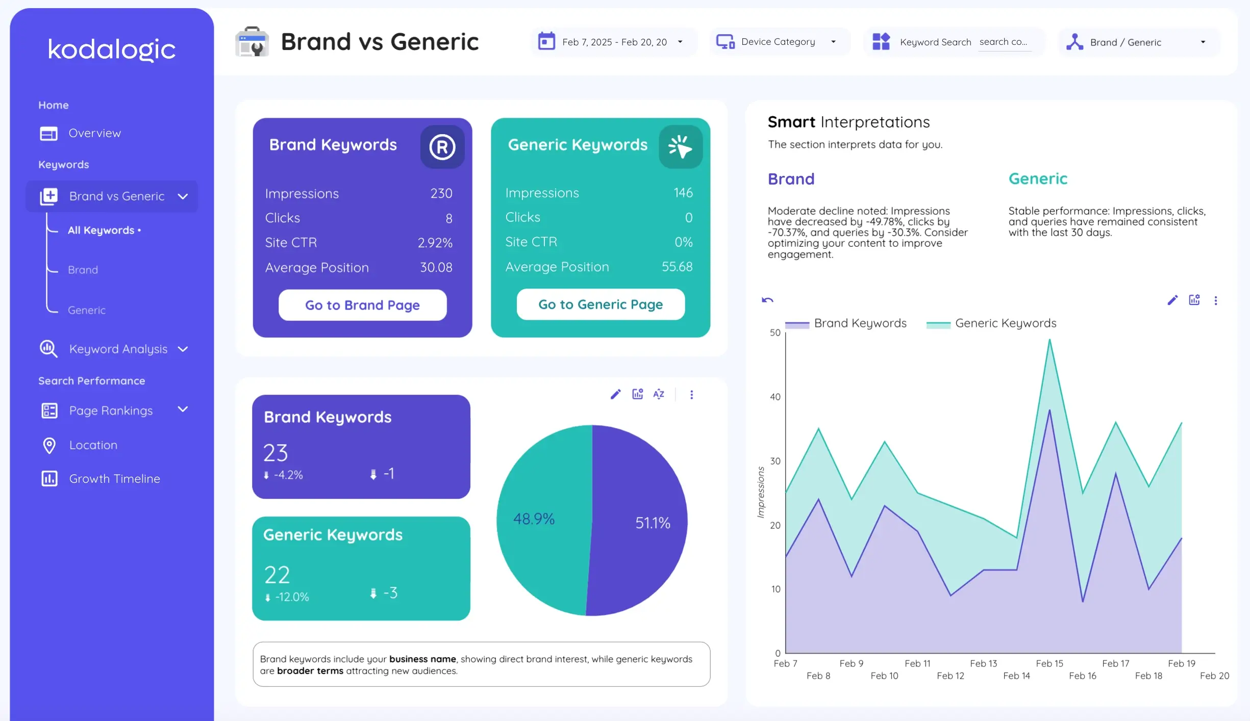
Page 2 puts the two sides next to each other: impressions, clicks, click-through rate and average position for each, a pie that splits the keyword count between them, an impressions chart with both series on the same axis. A table of every query with its side. Underneath each card sits a button that takes you to that side on its own, which is pages 3 and 4.
Pages 3 and 4 are not that page with a filter on it. Each is a small report about one half of the site. It is laid out the same way every segment page in the template is: five figures at the top with their movement against the previous period, a sentence printed on the page that defines what the segment is, a chart of the segment day by day against the previous thirty days, a panel that writes the reading in words. A full table of every query in that half with its impressions, its clicks, its rate and a coloured bar for its position.
The definition printed on the page is the part that earns its place in a meeting. A client who has never thought about the difference reads "brand keywords are search terms that include your business name" on the same screen as the number. And a client who asks how the SEO is going apart from people typing the company name has a page to be shown, not a filter somebody builds while they wait.
Combined, brand and generic are one number and a story that sounds fine. Separated, they are a brand people search for by name and an SEO position that may not have started yet. This are two different jobs for two different teams.
The split is not a filter you apply by hand every month. It is built into the report. The only thing you touch is the list of words that count as your brand: your company name, the ways people misspell it, your product names. You type them once, on screen, and every page of the report obeys them from then on.
That list is the one part of the setup that needs your judgment rather than ours, and it repays the attention. The names people type wrong, the product that has a name of its own, the brand that is also an ordinary word: each of those changes what the branded side is measuring. We have written up the three ways it goes wrong, and what to do about each, in the SEO dashboard guide.
Page 2 also carries a Smart Interpretations panel. This reads the period and writes the direction of each side in two lines: stable, improving or declining, in words, on a screen somebody can read without opening a chart. It is the report describing its own numbers, not an opinion about them. It rewrites itself every time the page refreshes. What it is and what it does not do has its own page.
Pages 5 to 7: short queries apart from long ones
The second classification sorts the table by how much the person typed. One to three words is a head term; four or more is a long-tail keyword. Page 5 puts the two sides next to each other exactly as the brand page does: four metrics each, a pie of the keyword counts, an impressions chart with both series, its own Smart Interpretations panel, and a button into each side.
Pages 6 and 7 follow the segment layout described above, with one thing the other segment pages do not have: a breakdown by exact word count. One row for one-word queries, one for two, one for three, each with its impressions, its clicks and its rate. That row is where "short tail" stops being a category and becomes a decision, because a property carried by two-word searches and one carried by three-word searches want different pages written for them.
Those pages answer a question that gets assumed far more often than it gets checked: whether the longer queries on this property really do convert better than the short ones. On some sites they do and on others they do not. One averaged number for the whole table can never tell you which kind of site you have. Two pages side by side can, in about fifteen seconds.
Pages 8 to 12: what each query was asking for
The third classification reads each query for the kind of question it is and files it as informational, navigational, commercial or transactional. It runs on every refresh, over every query, without anybody tagging anything.
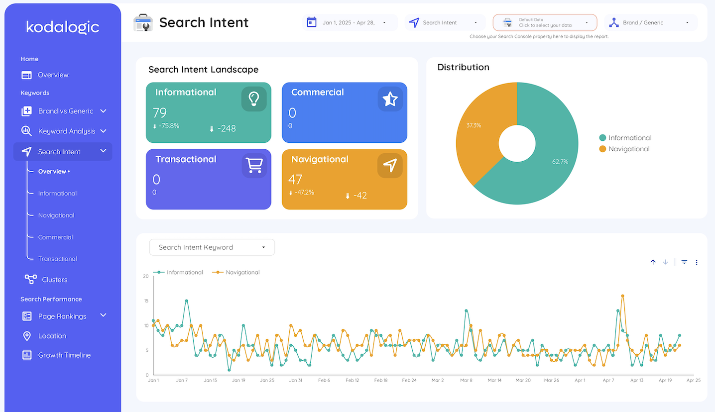
Page 8 holds the four counts with their change, a donut of the distribution, a chart of each intent over time. Two things that are easy to miss and do most of the work. The first is a bubble chart that plots every query by its average position against its click-through rate, sized by volume: the queries that are ranking but not being clicked separate themselves from the ones that are doing their job. The second is a table of every query with its intent, its impressions, its clicks, its rate and its position, filterable by text.
Pages 9 to 12 give each intent a page of its own, built exactly as the brand and generic pages are, with one chart added: every keyword of that intent plotted by impressions. The heavy queries separate themselves from the tail without sorting anything.
Each of those four pages also prints its own definition. The informational page says it shows the searches of people looking for answers, tutorials or general knowledge, which it calls early-stage research. That sentence is there so the page can be sent to somebody who does not work in SEO and still land. Four intents, four pages, four definitions already written: that is four conversations you do not have to have again next quarter.
That is what makes a position mean something. A transactional query at position 12 and an informational query at position 12 are the same row in Search Console and two different problems in the report: the first is revenue on page two, the second may be perfectly fine where it is. A property that sells nothing will show two intents empty, and that is the classification working rather than failing.
Page 13: queries grouped into the topics the site is about
The fourth classification groups queries by topic, which is what keyword clustering means here: the site's subjects, named the way the business names them, with every query filed under one of them.
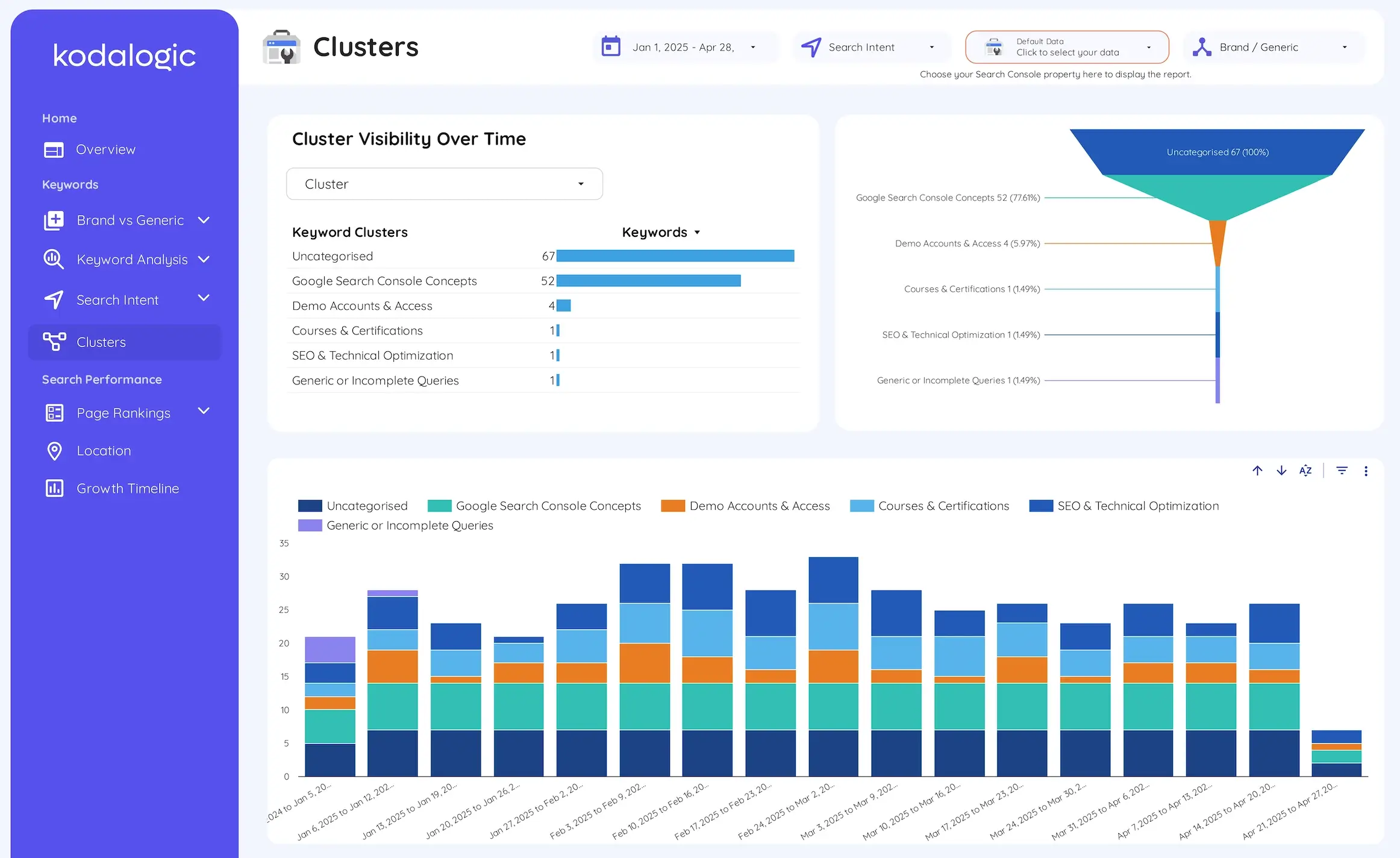
Three things sit on the screen above, and a fourth below it. A list of the clusters with the count of keywords in each. A funnel that turns those counts into shares.
The topics the site is actually visible for stand apart from the ones it merely touches. A weekly stacked chart of how many queries each cluster held. This is where a content team sees a subject gaining ground before any single keyword does.
And, further down the same page, a performance table with impressions, clicks, click-through rate and average position per cluster. This is the row a content team is judged on.
There is also a row named Uncategorised, and it is the most useful row on the page. Anything the report cannot file under a topic is, by definition, a subject nobody at the site has named yet. Sorted by impressions it becomes a list of things Google already shows the site for, that nobody has written for.
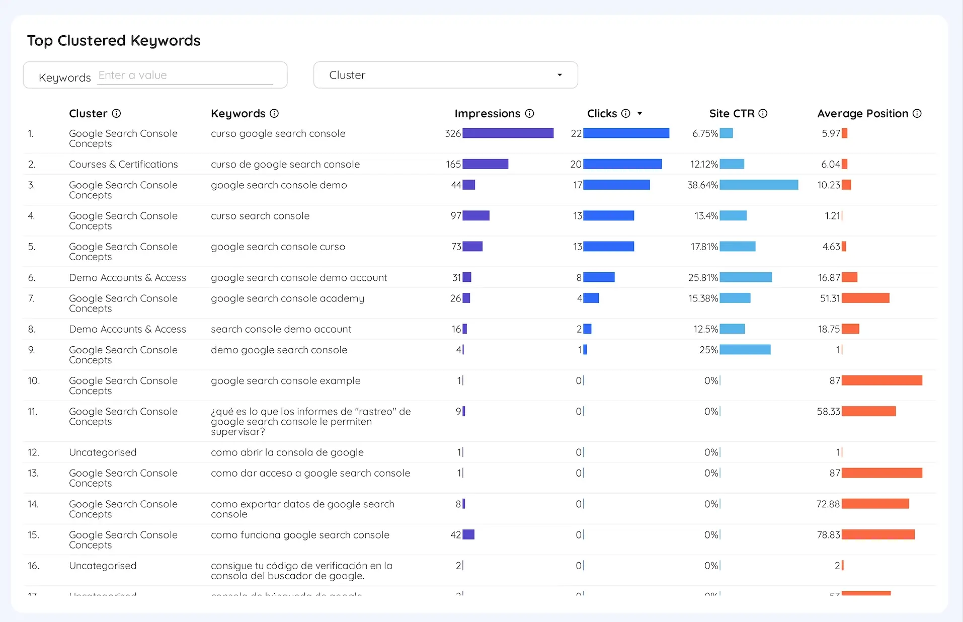
The table under the chart is where a topic gets checked query by query, and it is there for a reason. Every clustering scheme has edges: the same search typed two ways can land in two different topics. Both totals above are then off by the difference. What matters is having the screen that shows it to you, and being able to adjust the topic without opening anything technical.
Pages 14 to 17: which page of Google each keyword sits on
The fifth classification takes the average position of every query and drops it into a band. The result is the keyword ranking distribution, the chart most reports replace with a single number. The term itself is defined in our glossary entry for the keyword ranking report.
The template uses four bands: Top 3 for positions 1 to 3, Top 10 for 4 to 10, Top 20 for 11 to 20. The rest for 21 and beyond. In plain terms, the first three results, the rest of page one, page two, and everything after.
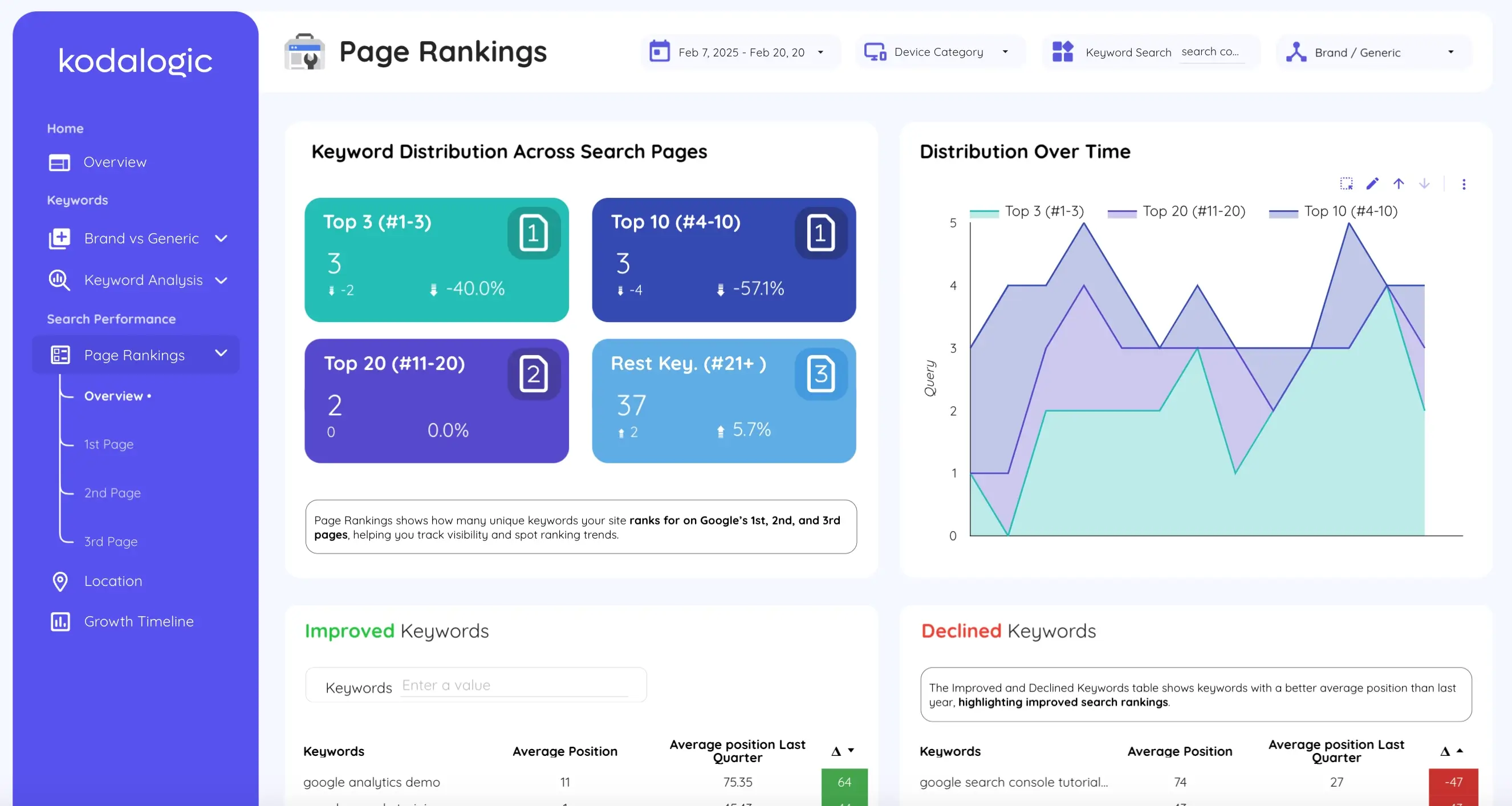
Page 14 shows the four counts, each with how many keywords it gained or lost against the comparison period. A chart of how those four bands have moved day by day. That chart is the one to put in front of a client who wants to know whether the work is landing: a band that thickens over a quarter is progress that no single keyword can show on its own.
This is why the bands exist at all. An average position in the thirties can be a handful of queries on page one and everything else far behind it. Every query sitting flatly in the middle. The average is identical. The four cards are not, and they take a second to read.
The lower half of the page is the sixth classification, and the one clients ask for by name: what changed. For every query, the report puts its average position now next to its average position in the comparison period, sorts by the difference. Paints the difference green or red. Improved Keywords on the left, Declined Keywords on the right, with a search box to find a specific query in either.
The comparison window is a decision, not a setting anybody should have to think about twice. The template ships comparing against the previous quarter, because that catches the slow slides and ignores last week: positions wobble from one day to the next without anything having changed on the site. A table that flags that wobble every Monday gets ignored by Tuesday.
Pages 15, 16 and 17 take one band each and give it a screen: the keywords on Google's first page, on the second, on the third. Each is laid out like the other segment pages. Each adds the one number that matters here: how many keywords the band held, day by day, against the previous thirty days.
That daily count is the one to put on a wall, because it answers the only question a client ever really asks, which is whether this is working.
Page 16 is the one an SEO opens on a Monday morning. A keyword on page two needs a handful of places to reach page one, where the clicks are. This is the screen that lists every query in that position.
One thing these pages cannot fix, and neither can any other report on this data: the band is assigned to the query, and the query already arrives averaged. Something that spent half the month at position 2 and half at 38 lands in Top 20 with an average of 20. Nothing in Search Console shows that it was never actually there. That is the cost of Google's own definition, and we would rather say it here than let you find it later.
Pages 18 and 19: where the impressions came from, and how the property has moved
Page 18 is Location: the same four metrics broken down by country. A property that looks flat in total can turn out to be growing in one market and sliding in another. It is also the page that explains a sudden change in average position more often than any other, because the same query ranks differently in different countries and the property average moves when the mix does.
Page 19 is the Growth Timeline: the whole window on one chart, as far back as Search Console holds it. Pages 1 to 18 compare this period against the last one, which is the question a month asks. This one shows the shape of the whole 16 months, which is the question a year asks. It is the page to open when somebody wants to know whether any of this has been working.
What happens on your property on day one
Nothing in the report needs to be built, configured or explained to anybody. It arrives finished.
From payment to a report on your own data
Copy the report
The link arrives right after checkout, with the setup guide next to it. One click makes a copy of the whole report inside your own Google account, where it becomes an ordinary Data Studio file that belongs to you.Point it at your property
Pick your Search Console property from the selector at the top of the page. All 19 pages fill with your own queries, positions and clicks, with no connector to install and no extra account to create.Type your brand names
The one thing the report cannot know on its own: your company name, its misspellings, your product names. From that moment the brand and generic sides of every page are telling two separate stories about your site. The intent and topic rules are already written and need nothing from you on day one.Make it yours and send it
Your logo, your colors, your fonts. Share the live link with a client, or schedule it to arrive by email on the cadence they expect.
That is the whole of it. The reason the demo matters: the report you open before paying is the same file that will be reading your own property afterwards. Not a video of it, not a tour, not a cut-down version.
Search Console on its own, and the same data in the report
The Search Console screen
- One flat table of queries, ordered by whatever column you last clicked
- Brand and generic mixed into the same average position
- A single average that cannot tell page one from page four
- Nothing about intent, nothing about topics, no written reading
- Built to be explored, one question at a time, by someone who knows it well
The keyword ranking report
- 19 pages, each one answering a question somebody actually asks
- Brand and generic apart, from the moment you type your brand names
- Four position bands with their movement against last quarter
- Search intent, topic clusters and query length, classified on every refresh
- Built to be read, by a client with no training and no time
The template is $129, paid once. It is the right choice in two situations: you report on more than one property and want the same report on each. You would rather spend your afternoons on the SEO than on the layout.
Two things come with it that usually are not included. Updates for life at no extra cost, so a page we add next year arrives in your copy too. Support by email until the report is running on your own property.
This is the day something goes wrong if it is going to: a property verified the wrong way, a data source that will not connect, a brand list that catches more than it should. And the demo is the same file you would be buying. The report you pay for is the report you already read.
4.97
Average rating
out of 5, on Fiverr
16
Reviewed more than once
the same buyer, coming back
27
Countries
where the reviewers wrote from
The middle number is the one to read. A rating says the job was done. People ordering again say it was done well enough to repeat, which is the only part an agency is really buying.
One of the repeat buyers puts it in a line: "Excellent Google Looker Studio design and customization service. Used multiple times now and always an awesome experience." To be straight about what that is, though: those are reviews of the work, not of this template. Kodalogic builds dashboards to order as well as selling them ready-made. The reviews come from that side of the business. They are all on the reviews page, every one, including the two-word ones. The no-refund clause is in the terms, section five, in the same words.
The keyword ranking report, page by page, is on its own page with the live demo embedded. the template itself is here. Scheduling it to arrive by email is a separate guide, because it is the same for any Data Studio report. connecting Search Console is another, for the people who like to know what happens underneath.
What this report does not settle
Two questions need a different tool, because the data is not in Search Console at all. A competitor's position is the first: Search Console reports only on properties you own. A keyword the site has no impressions for yet.
A position on Bing, is the second: Search Console reports what happened, not what would happen. For those, a rank tracker is the tool with the answer, and it is a subscription per client. For everything on the nineteen pages above, it is a second copy of numbers Google already gives you for free.
The largest limit inside the report is the one in the first section: every position here is an impression-weighted average. The bands are bands of averages. A query filed as Top 10 may have been on page three for half the period.
The second is that per-query clicks never add up to total clicks. Google withholds a query from the table when it was not issued by more than a few dozen users over two to three months. Counts its clicks in the totals anyway. Every rate on every page describes the itemised table rather than the whole site. This is worth saying out loud in a client report before somebody notices and asks.
And three things the report does not cover. It does not measure what the clicks did after they arrived, which is Google Analytics 4. The Web & SEO template is the one that puts the two sources side by side.
It does not compare two sites, because Search Console cannot. And the intent and cluster rules are ours: they run from day one without being touched. On your property they will misfile some queries.
The Uncategorised row is the screen that tells you which ones and lets you name a topic they belong to. That is tuning, not setup, and it is a quarterly job rather than a daily one.
What is left is the trade the price describes. Search Console already holds the answer and hands it over for nothing, in one table nobody can read out loud. The nineteen pages are that table already split, already classified and already written up, on the day you buy it rather than the month you get around to building it.
Frequently asked questions
- What is an SEO keyword ranking report?
- The Search Console query table arranged by rules so that it answers questions: branded against generic, position bands, movement, intent and topic. The term has its own entry in our glossary; this page is about how each of those rules is built into the template.
- What should a keyword ranking report format include?
- Six sections, in this order: the four Search Console metrics with their change against the previous period; branded queries separated from generic ones; the count of queries in each position band (1 to 3, 4 to 10, 11 to 20, 21 and beyond); the queries that improved and declined most; queries by search intent; and queries grouped by topic.
- How do I get a keyword ranking report from Google Search Console?
- Open the Performance report, set the date range, and export the Queries table. That gives you up to 1,000 rows with impressions, clicks, CTR and average position. For more rows, or for a report that refreshes itself, connect the property to Data Studio through the official Search Console connector, which reads up to 50,000 rows per day.
- What is an SEO rank report?
- The same thing as an SEO keyword ranking report, in fewer words: a report of the queries a site ranks for in Google, their positions, and how those positions moved. The name varies far more than the contents do. An SEO rank report, an SEO ranking report, a Google keyword ranking report, keyword ranking reports, an SEO ranking report template: the useful ones all answer the same six questions listed above, and every one of them is built from the same Search Console query table.
- What is a keyword rankings and visibility report?
- A keyword ranking report that also shows the spread, not just the average: how many queries sit on page one, how many on page two, how many beyond, and how that distribution moved. Visibility is the count across the bands. A site can hold its average position and lose visibility, if the queries that left were the ones on page one, and that is the movement a single average number hides.
- What is keyword ranking distribution?
- The count of a site's queries in each band of average position, usually top 3, 4 to 10, 11 to 20 and 21 and beyond, tracked over time. One average position cannot tell six page-one queries plus forty on page four apart from forty-six queries sitting in the middle; four bands can.
- Why does my average position not match what I see when I search?
- Because it is an average of the topmost result from your site across every impression, in every country, device and personalized result set where the query appeared. Google's documentation says results are specific to the time, place, device and history of the person searching, so a single search is one sample of a distribution the report averages.
- What is a branded keyword ranking report?
- The same report filtered to queries that contain your brand name, its misspellings and your product names. Kept apart from generic queries, it separates two things a single organic figure hides: people searching for you by name, which is awareness, and people finding you for the problems you solve, which is SEO.
- Can a keyword ranking report be automated?
- The data can, and so can the delivery. Connected to your property, every page recalculates on open and the report can be emailed on a schedule your client expects. Nothing in Search Console classifies a query by brand, intent or topic on its own: the template arrives with that classification already built, which is what makes the pages readable without an analyst in the room.
- Can I use the template for several clients?
- Yes. Copying the report into your Google account makes it an ordinary Data Studio file. One copy per client, each pointed at that client's Search Console property, each with its own brand list. The price is one payment, not one per client.
- What access do I need to a client's Search Console?
- View permission on their property is enough. Google's documentation for the Search Console connector asks only that you have at least view permission, which a client grants from their own Search Console without giving up ownership and can withdraw at any time. The row limit that governs how much the report reads is counted per site, not per account, so running one copy per client does not make them compete for the same allowance.
Sources
- 1.Google Search Console Help, What are impressions, position, and clicks? Source for the definition of position and of average position across all impressions. ↩
- 2.Google Search Central blog, A deep dive into Search Console performance data filtering and limits. Source for the 1,000-row export limit of the interface, the 50,000-row daily limit of the API and the Looker Studio connector, and the definition of anonymized queries. ↩
- 3.Google Search Console Help, Performance report (Search results): Overview and basic setup. Source for average position being the position of the topmost result from the site, and for results being specific to the time, place, device and history of the searcher. ↩
- 4.Google Cloud documentation, Connect to Search Console (Data Studio). Source for the access a Google account needs to use a property as a data source: at least view permission on that property. ↩

Written by
Isaac CorreaHe runs the commercial side of Kodalogic and co-founded Hellomatik. Before that he built more than two hundred Looker Studio dashboards for clients, and collected 107 five-star reviews doing it.